Laptop Battery Life Challenge is an illustration that demonstrates the importance of analyzing the data before thinking of any ML […]
Tag: ggplot2

ggplot2:: Histogram in R using Titanic Dataset
A Histogram is a graphical presentation to understand the distribution of a Continuous Variable. To create a histogram, the first step […]
ggplot2::Bar Plot in R using the Titanic Dataset
A Barplot is the graphical representation of categorical data with some rectangular bars whose height is proportional to the value that […]

ggplot2::Boxplot in R using Titanic Dataset
A Boxplot is usually used to understand the distribution of a continuous variable. Through box plots, we can display the minimum, […]
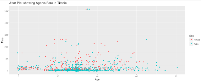
ggplot2:: Jitter plot in R using Titanic Dataset
A Jitter Plot is almost the same as the scatter plot that I discussed in my last post. It took […]

ggplot2::Scatter Plot in R using Titanic Dataset
A scatter plot is usually used to understand the nature of the relationship between two continuous variables. Thus, a scatter plot combines […]