Problem:
Create a Scatter Plot in R and gradually add layers to it
Solution:
We will use the ggplot2 library to create our first Scatter Plot and the Titanic Dataset. The Data is first loaded and cleaned and the code for the same is posted here.
Now, let’s have a look at our current clean titanic dataset.

Now, let’s plot Age and Fare attributes to find a relationship. Before that, let’s have a look at the data for these two variables.
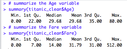
So, the Age of the passengers varies from 0 to 80 and the fare ranges from $0 to $512.00.
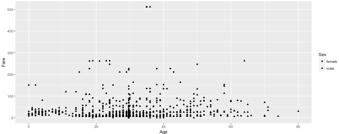
Now, let’s plot these two variables.

Interestingly, the above graphical representation answers some questions and even helps us to raise further questions. For Example, what fascinating facts we are seeing here?
- Passengers above Age 60 are quite less.
- Most of the passengers paid a fare <100 with a few exceptions.
- A very few numbers of passengers of Age above 30 and less than 40 have paid a fare more than $500
Thus, one argument of aes() is the shape of the points. There are a finite number of shapes that ggplot() can automatically assign to the points. But, we need to pass a Categorical Variable to the Shape attribute. Okay, so how about some color?
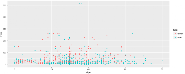
Again, another useful argument of aes() is the color of the points and we need to pass a categorical variable here. We can even pass size or alpha argument in the aes() to modify the look and feel.
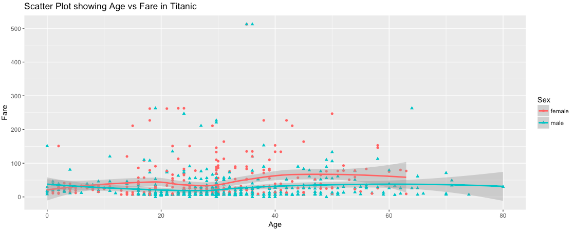
We can use geom_smooth() function to add a smooth line over the points. Now, let’s use the geom_smooth() and add a title to our scatter plot example.

Unknown
It's really a nice experience to read your post. Thank you for sharing this useful information. If you are looking for more abouthadoop training course fees in chennai | Hadoop Training in Chennai Omr
Unknown
I think things like this are really interesting. I absolutely love to find unique places like this. It really looks super creepy though!!
R Programming institutes in Chennai | R Programming Training in Chennai | R Programming Course Fees
Tejuteju
It was really a nice article and i was really impressed by reading this Data Science online Training