A Barplot is the graphical representation of categorical data with some rectangular bars whose height is proportional to the value that they represent. Barplots are useful to represent two different things:
The count of cases for each group – The height of the bar will represent the count of cases. This is done by using stat = “bin” (which is the default). It is incompatible with mapping values to the “Y” aesthetic.

The value of a column in the dataset – The height of the bar will represent the value in a column of the data frame. This is done with stat = “identity”.

Problem:
Solution:


Bar charts are automatically stacked when multiple bars are placed at the same location. We can instead pass position = “dodge” and modify the look.

Error:
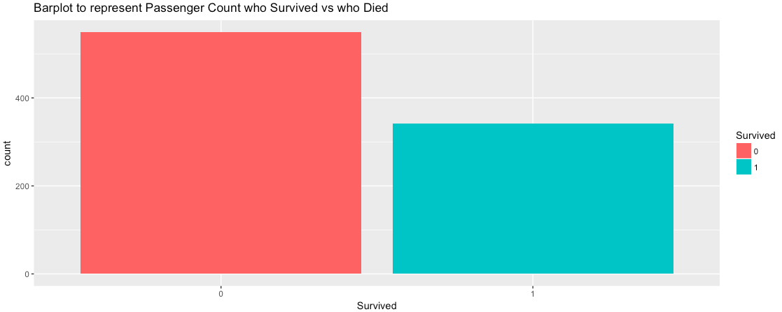
That means, if we are trying to plot the Count of the variable, we should not pass the Y aesthetic value and the argument in geom_bar is by default stat = “bin”.
Now, let’s use Barplot to represent the Value of a variable. In this case, we need to pass both the X and Y aesthetic value, and in geom_bar() we need to pass the argument stat = “identity”.
So, here we are plotting the ticket Fare the passengers paid for different Classes and below graph is the result.

The graph clearly displays that the passengers in the 1st class who paid more Fare had a better survival rate than the passengers in the 2nd class and 3rd class. Thus, it was our obvious hypothesis and the plot has proved the same.
Now, let’s try to plot two categorical variables “Sex” of the passenger and their “Survival” ratio.

From the above plot, it looks like the Female passengers have a better survival ratio. Even, the below data proves the same.

Aditi Digital Solutions
good article about data science has given it is very nice thank you for sharing.
Data Science Training in Hyderabad
Komal
nice information on data science has given thank you very much.
Data Science Training in Hyderabad