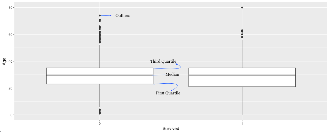
A Boxplot is usually used to understand the distribution of a continuous variable.
Through box plots, we can display the minimum, lower quartile (25th percentile), median (50th percentile), upper quartile (75th percentile), the Maximum, and all “outlying” points individually.
Thus, the line that divides the box into 2 parts represents the median of the data. The end of the box shows the upper and lower quartiles. The extreme lines show the highest and lowest value. But a boxplot hides the number of values existing behind the variable.
Problem:
Create a Box Plot in R using the ggplot2 library.
Solution:
We will use the ggplot2 library to create our first Box Plot and the Titanic Dataset. The Data is first loaded and cleaned and the code for the same is posted here.
Now, let’s have a look at our current clean titanic dataset.
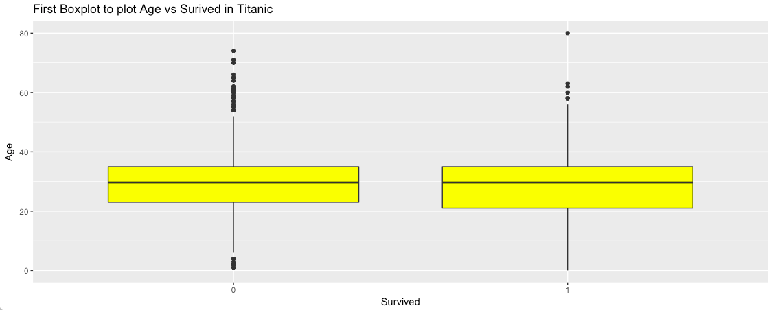
For this example, we will try to plot the continuous variable “Age” against the categorical variable “Survived”. We will use the geom_boxplot() for the same.
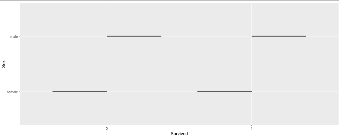
As per my understanding, Boxplot is best to use when we are plotting a Continuous Variable against a Categorical Variable. Let’s try to plot 2 categorical variables using Boxplot and see the result.
The above plot does not make much sense. For this scenario, we can use some other graphical representations like
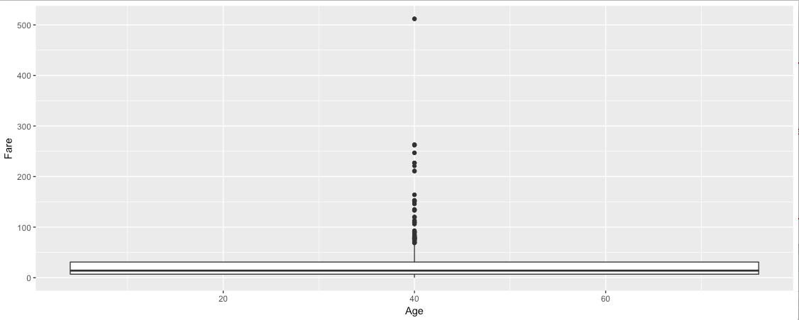
Barplot. Now, Let’s try to plot 2 continuous variables using Boxplot.
Hmm, so we got a graph. We can see the Median of the Fare Variable and the quartiles. But how about the distribution of the Age Variable? Also, there is a warning like below:
Warning message:
Continuous x aesthetic — did you forget aes(group=…)?
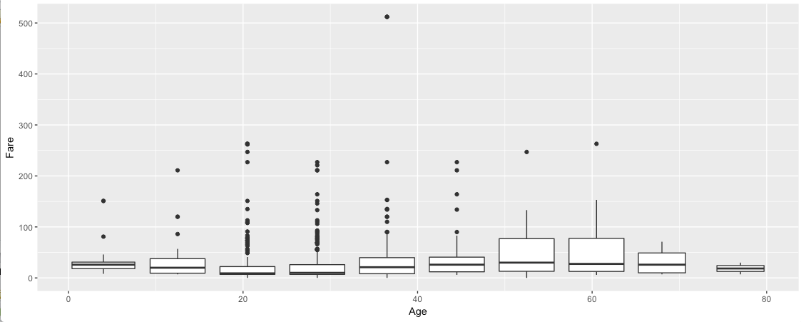
We can use cut_width() or cut_interval() functions to convert the numeric data into categorical and thus get rid of the above warning message.
 |
| using cut_interval() |
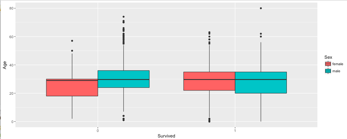
Now, let’s add some more features to our first Boxplot. Let’s find out how the Age and Sex of the Passengers have affected the Survival rate.
We can also use any color of our choice in the Boxplot using fill().
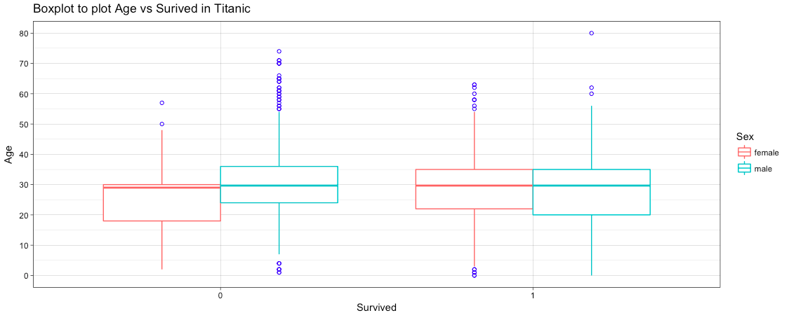
Also, we can use the outlier.colour() to modify the color of the outliers.
ggtitle() can be used to add a title. Different Themes are available which can be chosen to modify the look and feel of the plots.
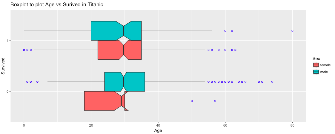
We can use coord_flip() to flip the variables in X and Y axes. Another thing we can do with our boxplot is adding a notch to the box where the median sits to give a clearer visual indication of how the data is distributed within the IQR. This can be achieved by adding the argument notch = TRUE to the geom_boxplot option.
1