
Problem:
Solution:

The jitter geom is a convenient shortcut for geom_point(position = “jitter”)
Let’s plot Age and Fare attributes to find a relationship the way we did in our Scatter Plot example. The only difference is we are going to use geom_jitter() for the same.
The graphs look exactly the same as the scatter plot. Now let’s add some color to the Datapoints as per the Sex of the passengers.
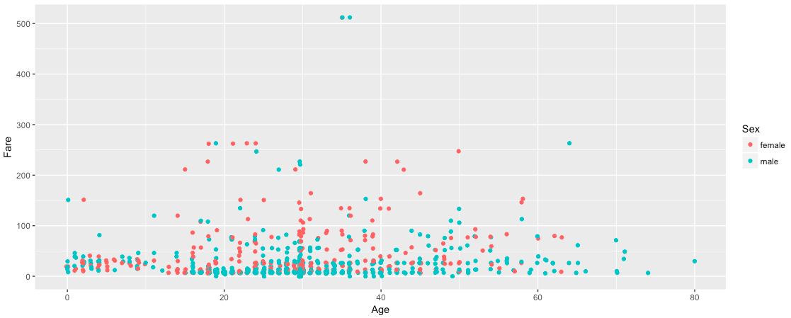
Still, same as the Scatter Pots! So how is it different?
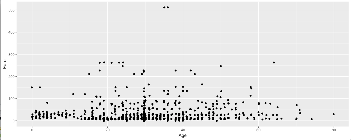
I was trying to raise some questions examining the data. I asked, how many passengers are there who paid a fare greater than $500? Are they Male or Female? My above graph shows there are only 2 passengers in that category and both of them are Male. I tried to validate my data.

My query shows there are 3 passengers who paid a Fare greater than $500. One of the passengers is Female and the other two are Male. The Female passenger is age 35 and the two Male passengers are age 35 and 36 respectively. So, where is my third Female Datapoint in the above graph and how can we display that data point?
Since we are plotting Age vs Fare, the data points are (512,35), (512,36) and (512,35). So, there are 2 points at (512,35) and they are overlapping. Even, changing the color as per the Sex of the passenger did not show up the hidden point.
Now, let’s use geom_jitter() with position argument.
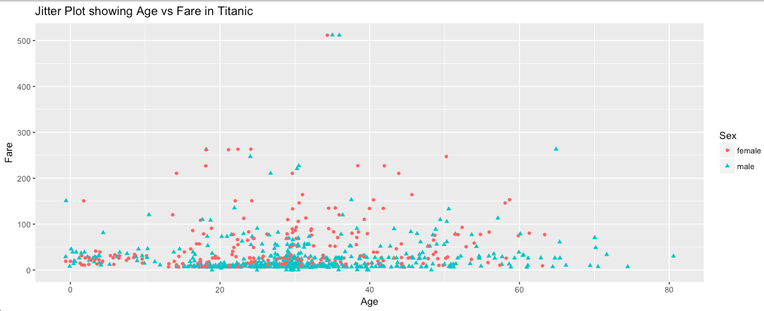
In the above plot, we are able to see three data points, 2 males and 1 female as expected. The above piece of code will generate slightly different plots for each run since the jitter is added randomly each time. Arguments width and height signifies the amount of vertical and horizontal jitter. The jitter is added in both positive and negative directions, so the total spread is twice the value specified here.
Although jittering can be a useful tool, it actually means adding additional noise to the data.
So, from a data visualization perspective, this additional variation can be misleading and can lead to misinterpretation of data.
Thank You!
1