A Barplot is the graphical representation of categorical data with some rectangular bars whose height is proportional to the value that […]
Author: Oindrila Sen
A decade of experience in collecting, cleaning and visualizing data. But now I am learning and practicing new tools and different techniques.
Let's dig and find out what is the story behind that Data. Let's do it together! Let's solve, fail and try again because discovering something new is always fun.

ggplot2::Boxplot in R using Titanic Dataset
A Boxplot is usually used to understand the distribution of a continuous variable. Through box plots, we can display the minimum, […]
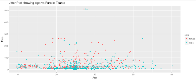
ggplot2:: Jitter plot in R using Titanic Dataset
A Jitter Plot is almost the same as the scatter plot that I discussed in my last post. It took […]

ggplot2::Scatter Plot in R using Titanic Dataset
A scatter plot is usually used to understand the nature of the relationship between two continuous variables. Thus, a scatter plot combines […]
Fascinating introduction to ggplot2() in R
A visual or graphical representation of a dataset can be intriguing. Before getting into any formal methods, it helps one to […]