A Histogram is a graphical presentation to understand the distribution of a Continuous Variable. To create a histogram, the first step is to “bin” the range of values i.e. divide the X-axis into bins and then counting the number of observations in each bin.
A Histogram looks very similar to Bar Plots. But, how it is different?
Below are some differences that I have gathered.
|
Bar Plot
|
Histogram
|
|
Usually used to display “categorical data”
|
Usually used to present “continuous data”
|
|
Bars in bar plots are usually separated
|
Bars in Histogram are adjacent to each other
|
|
Used to compare variables
|
Used to show distributions of variables
|
|
Bars of a bar plot can be rearranged at will
|
It does not make sense to rearrange the bars of a histogram
|
Problem:
Create a Histogram in R using the Titanic Dataset
Solution:
We will use the ggplot2 library to create our Histogram and the Titanic Dataset. The Data is first loaded and cleaned and the code for the same is posted here.
Now, let’s have a look at our current clean titanic dataset.
Now, let’s plot the basic histogram to understand the distribution of the variable “Age”. For Histograms using the ggplot2 library, we need to use geom_histogram() function to create the plots. First, let’s have a look at how the Age is distributed.
So, the Age of the passengers varies from 0 to 80. Now, let’s plot the histogram.
In the console, there is a message like below:
`stat_bin()` using `bins = 30`. Pick better value with `binwidth`.
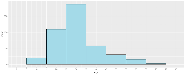
By Default, 30 bins are created and we can modify the look of the Histogram by passing an argument called “binwidth” and thus adjusting the range.
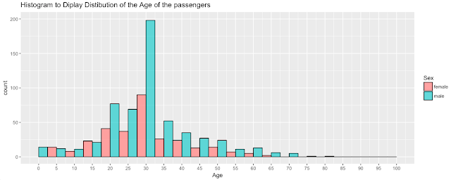
Since the “binwidth=10” for the continuous variable “Age”, the “Age” is divided into “bins” of range “5-15”, “15-25”, “25-35” and so on. Now, let’s change the binwidth to 5 and add some color and a title to our histogram.
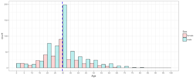
We can also add a line for the Mean of the variable “Age” which is around 29.68 using the function geom_vline().


